
Beyond Aesthetics: Is Your Wall Color Stressing You Out?
Color as a Nervous System Signal
In the world of "Smart Homes," we talk a lot about automation, but we rarely talk about the biological automation happening inside our own bodies. Every time you walk into a room, your eyes aren't just seeing a "pretty shade of blue" or a "modern gray." Our eyes are processing specific wavelengths of light that send an immediate, non-negotiable signal to your nervous system.
If you feel inexplicably anxious in your kitchen or restless in your bedroom, you might be a victim of Chromotoxicity.
Color therapy (Chromotherapy) isn't "woo-woo" wellness; it’s rooted in how our autonomic nervous system (ANS) responds to light frequencies. We can split these into two primary modes:
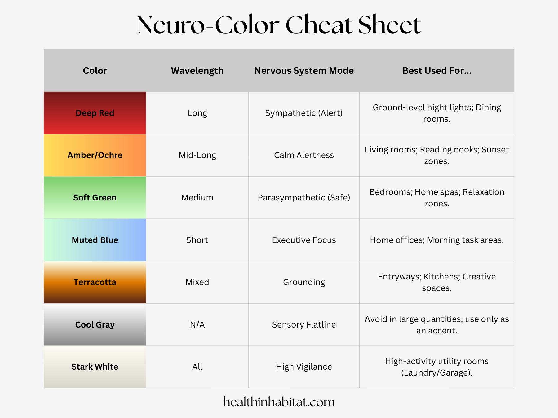
1. The "GO" Signal: Reds, Oranges, and Yellows
These long-wavelength colors are physically stimulating. When your eyes absorb red light, it signals the Sympathetic Nervous System—the "Fight or Flight" branch.
The Biological Response: Increased heart rate, elevated blood pressure, and a spike in cortisol.
The Psychological Impact: These colors demand attention. They are the colors of fire and blood; they keep us alert and vigilant.
The "Biological Home" Fix: Use these in high-energy zones like dining rooms (where they stimulate appetite) or as low-intensity floor lamps at night to stimulate/preserve melatonin.
2. The "SLOW" Signal: Blues, Greens, and Violets
These shorter wavelengths are generally associated with the Parasympathetic Nervous System, the "Rest and Digest" branch.
The Biological Response: Lowered body temperature, slower breathing, and reduced muscle tension.
The Psychological Impact: Blue is the color of the vast sky and the deep ocean; it signals expansive safety and calm. Green, the color of life and water, tells the brain, "There is abundance here; you can lower your guard."
The "Biological Home" Fix: Use soft greens and muted blues in bedrooms and "sanctuary" spaces to encourage the Vagus nerve to switch into repair mode.
The Hidden Danger of "Millennial Gray"
Modern design is currently obsessed with sterile whites and "cool grays." While they look clean in a magazine, they can be a drag on your mental health.
Sensory Deprivation: In nature, gray is the color of storm clouds and dead stone. A home that is entirely monochrome gray can lead to a state of "nervous system flatlining," often manifesting as listlessness, brain fog, or low-level depression.
Blue Light Amplification: Cool whites and grays act as a mirror for the blue-spike LEDs in our screens and bulbs, bouncing those "alertness" signals around the room even when you're trying to wind down.
Now let’s take a soft pivot.
Perhaps You’re wondering…..
"If Red has a high-arousal frequency that increases heart rate, why do we recommend Red Light to Help with Sleep?"
The answer lies in the difference between systemic stimulation and circadian signaling. Think of it like this:
Visual Color = Psychology
Spectral Light = Biology
When you are wide awake, Red is an "action" color. Because it has the longest wavelength, it "hits" the eye with a sense of urgency. This is why stop signs and emergency lights are red. In a brightly lit room, red walls can keep your heart rate slightly higher and your mind more "vigilant."
At night, the rules change because of a specific protein in your eyes called Melanopsin.
The Blue Light Trap: Melanopsin is hyper-sensitive to blue wavelengths (460-480nm). When it sees blue, it tells the brain it is 12:00 PM, instantly suppressing melatonin.
The Red Light "Cloak": Red light sits at the opposite end of the spectrum. Melanopsin is essentially "blind" to deep red wavelengths. Therefore, while red might be "stimulating" to your mood, it is invisible to your sleep clock.
Think of it this way: Blue light is a 'Loud' frequency that screams at your brain to wake up. Red light is a 'Quiet' frequency that whispers, allowing your sleep hormones to stay in the lead."
How to Audit Your Home’s "Neuro-Palette"
To create a home that supports your biology, follow the Ancestral Light Scale:
The High-Noon Zone (Home Office): Use crisp, clear colors to encourage "Executive Function" and focus.
The Sunset Zone (Living Areas): Transition to earth tones—ochres, creams, and terracotta. These colors "absorb" blue light and signal to your brain that the day is ending.
The Blackout Zone (Bedroom): Avoid "vibrant" colors entirely. Think deep, dark, and muted tones that allow the pineal gland to do its job without "visual noise."
Words such as “drama” and “soft” are used in interior design a lot to describe the energy of color. When choosing a paint color, apply those same words to describe the energy you want to bring to that space.
The Consultant’s Take
"Your home is a bio-feedback loop. If you want to change how you feel, you have to change the signals you are sending your brain. Stop painting for the 'resale value' and start painting for your Vagal tone."